I’ve always loved seeing how houses and rooms are laid out. I think it’s fun to see how you can move walls/furniture around to get the most room out of space.
Once we picked out cabinets and counters, we had to figure out how many and what sizes we needed, which meant it was time to design the kitchen layout!
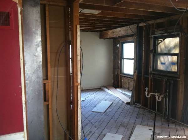
We had already decided we were adding a small addition to our kitchen so that it would be a full rectangle instead of the L-shape.
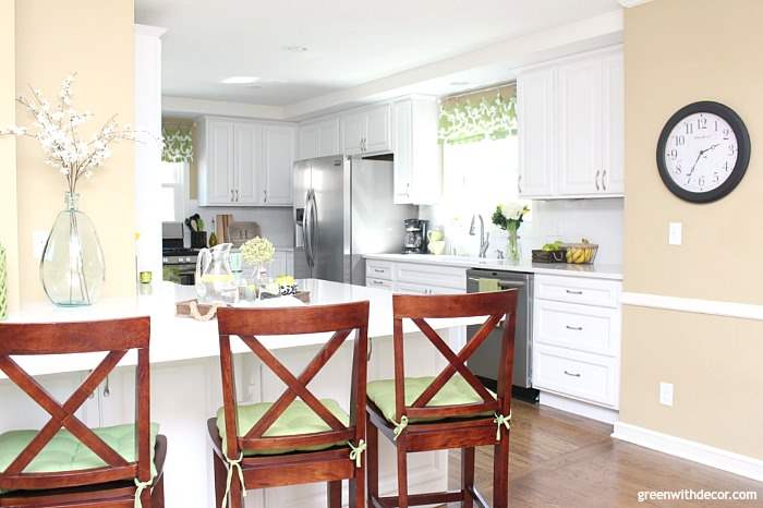
We were also set on having a breakfast bar where we had knocked down the wall between the original kitchen and dining room. I love having a place to sit and chat in the kitchen – breakfast bars are perfect for that.
There were some other things to consider when designing the kitchen layout:
Window placement
There was a window on the side wall that we had to work around. We wanted to keep this one since it was the only window on this wall. I love natural light.
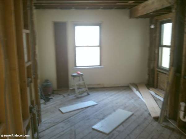
We had decided we could forgo the window in the original bump out in exchange for more cabinet space. The old owners had used that space for a small eating area.
Since we had opened the wall between the kitchen and dining room to include the dining room eat-in area as part of the new bigger kitchen, we didn’t need to keep this original eat-in area but instead planned to use that space for a bigger work area.
The third window in the original space was along the back wall we knocked down for the addition. We wanted to put another window along that wall, preferably above the sink.
Kitchen work triangle
The kitchen work triangle – the placement of the stove, sink and fridge – was important to us. We wanted the three to be close enough that it would be convenient to prep and cook food.
Plumbing location
We didn’t want to deal with any drastic plumbing moves (way expensive!), so we hoped to keep the new sink in relative proximity to where the original sink had been.
Counter space
Plenty of counter space was also important to us! We didn’t want to be cramped when in there preparing food together.
We played around with the placement of the stove, sink and fridge in relation to the windows and openings to the original dining room and back hallway.
It took some time to get everything just right, but I loved it!
Below is the layout we came up with.

We liked the L-shape kitchen triangle, with the stove on one side and the sink/fridge along the adjoining wall.
This post contains affiliate links. This means if you click the link and buy something, I may receive a small percentage of sales at no extra cost to you.
This left us the other full wall to use for a pantry and the half-wall for a huge breakfast bar that would be perfect for entertaining.
Best of all, this layout gave us plenty of counter space so multiple people could prepare food without being on top of each other.
Have you designed a kitchen layout? What’s most important to you?
GET THE LOOK:
Since a popular question I get is “Where’d you get that?!,” here are links to the same or similar sources:
- Wall color: Camelback by Sherwin Williams
- Counters: Blanco Canvas quartz
- White subway tile
- Window valances (DIY)
- Curtain rods here, but they’re not always available. These are similar.
- Curtain clip rings
- Green spatula
- Initial tray
- Cabinet handles
Planning your own renovation?
Download my printable Kitchen Renovation Checklist so you can easily keep track of each step.
*Please note: All printables and downloads designed by Green with Decor are for personal use only. Please do not alter the files or claim them as your own. These files are not intended for resale, nor are the printed versions of these files.
Remember to bookmark or pin this post if you want to save it for later!
Want to read more posts like this?
Follow along: Get my emails | Facebook | Pinterest | Twitter | Instagram
Leave a Reply