Sherwin Williams’ Agreeable Gray is a pretty, light gray paint color for any room in the house: living room or family room, dining room, foyer, hallway, bedroom, home office and more.
Gray paint is EVERYWHERE these days!
I was always all about tan paint (it’s warmer!), but walking into a third house with walls that needed to be painted, I figured it’d be a fun time to try out gray paint and see if we like it. (See our favorite whole house neutral paint colors here.)
We looked at a LOT of gray paint samples and decided on what seems to be everyone’s’ favorite light gray paint, Sherwin Williams’ Agreeable Gray (SW 7029).
This post contains affiliate links. This means if you click the link and buy something, I may receive a small percentage of sales at no extra cost to you.
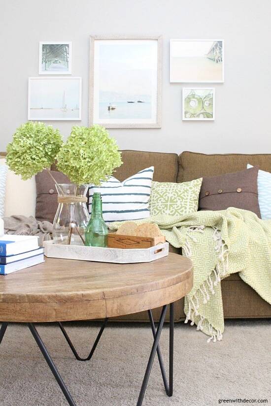
GET THE LOOK: Couch | Coffee table (similar) | Artwork: boat #1, boat #2, beach/pier, green fishing nets | Pillows: navy striped, brown, green + white | Green blanket
What Kind of Gray is Sherwin Williams’ Agreeable Gray?
It’s pretty and light enough that the gray doesn’t overpower a room. I didn’t want anything too dark.
I like it, but I think people tend to either like tan or gray paints and whichever color family you like is what you should go with. After living with both, I can say I’m a tan paint person. I like Agreeable Gray, but I miss the ‘warmth’ tan paint gives a room.
I’ve heard many people say Agreeable Gray is a warm greige paint… I’m not sure about that. I definitely think it’s gray, not a tan-gray mix.
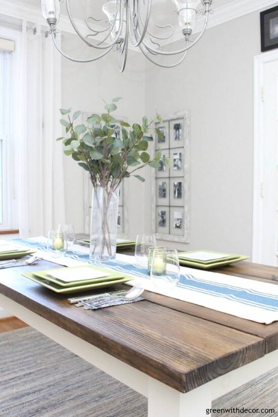
GET THE LOOK: Farmhouse table (DIY) or similar | Table runner (similar) | Faux eucalyptus | Windows turned picture frames (DIY) | Rug
That being said, if you’re looking for a nice light gray, Agreeable Gray is a pretty neutral paint color. It looks great with white trim (and white curtains!) and with blue, green and neutral decor and furniture. I like it because it doesn’t take on a blue or green hue the way many gray paints do.
The only time I’ve noticed a colorful undertone is on the wall right near that picture of the pier (upper right corner), which has some pink/coral-ish in it. I think it can make the Agreeable Gray look a bit pink when the sun hits it. (See how the wall on the other side of the gallery wall looks more gray?)
It’s nothing crazy, just something to consider if you’d be decorating with a lot of pinks or corals. (And if you’re not using pinks, it’s not something I’ve noticed anywhere else in the house so I wouldn’t worry about it!)
We’ve used Agreeable Gray in the living room, dining room, foyer, hallway, bedrooms and home office (pictures of all below).
Today’s post is part of the ongoing paint color series to hopefully help you guys see paint colors in real spaces! Picking paint colors can be a challenge – there are just SO many of them!
You can catch up on other colors in the series here: Camelback (tan), Ryegrass (green), Aesthetic White and Krypton (blue) or see all of my painting tips and tricks here.
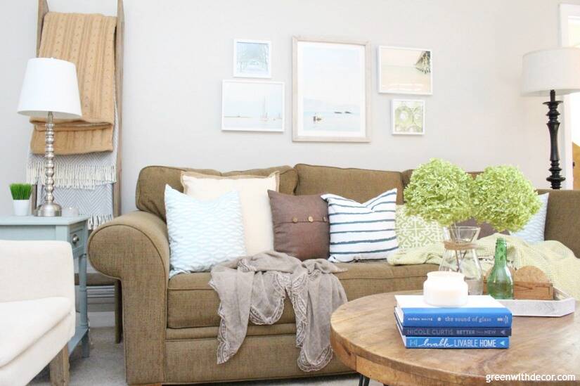
Agreeable Gray paint in a living room or family room

GET THE LOOK: Chaise | Side table | Artwork | Lamp shade | White + blue pillow | Cream + jute pillow
I really love Agreeable Gray with the white curtains and white trim (and white dresser!). It all just seems so coastal and casual.
GET THE LOOK: White chest(drawer handles) | Crates (similar here orhere) | Curtains | Curtain rods | Rope sphere | Faux boxwood plant
Click here to see more agreeable gray in my living room makeover reveal!
Agreeable Gray paint in a dining room
You can see how light Agreeable Gray is when next to other gray/silver pieces like our gray dining chair and the silver chandelier.
GET THE LOOK: Farmhouse table (DIY) or similar | Chair | Table runner (DIY) | Jute chargers | White plates | Ship wheel
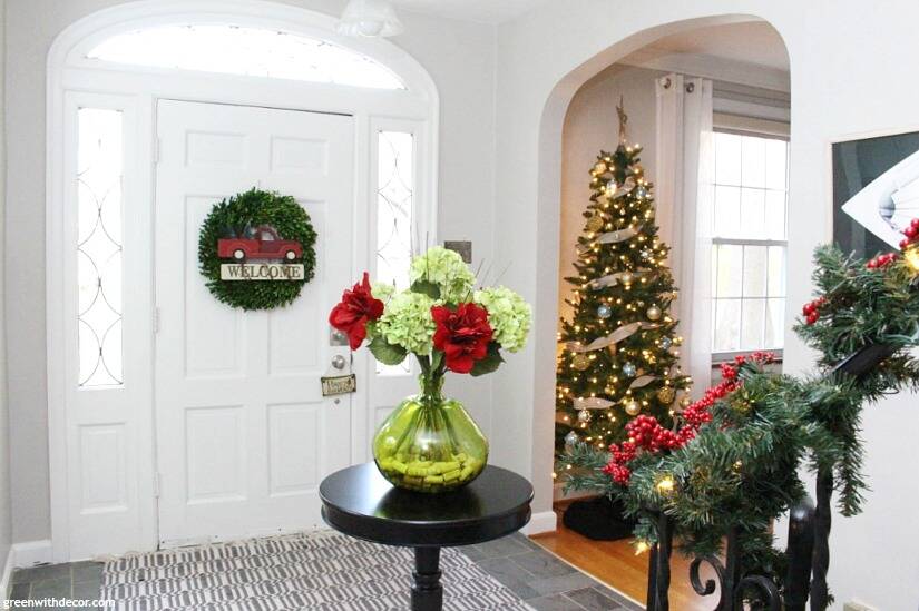
Agreeable Gray paint in a foyer
We still have some decorating to do in here, but here’s a peek from Christmas! Plus this shows you what it looks like with slate floor.
Agreeable Gray paint in a hallway
You can see Agreeable Gray here with the white and wood trim and tan carpet. It’s a good neutral that flows well with everything else.
GET THE LOOK: Painted chair (DIY) or similar | Pillow
Agreeable Gray paint in a bedroom
We’re still working on decorating the bedrooms in this house, but here’s a peek at Agreeable Gray with a blue dresser I just painted! It really pairs well with blues and greens.
GET THE LOOK: Painted dresser (DIY) | Hardware here or here | Vase | Lamp
Agreeable Gray paint in a home office
By ‘home office’, I mean a little corner of the dining room, but hey whatever works, right?!
GET THE LOOK: Chair | Painted desk (drawer pulls and crystal knob) | Furniture raisers | Green basket | Green clipboard | Cork bulletin board
As is often the case with paint colors, I think the Agreeable Gray paint swatch looks a bit different (darker and with more tan undertones) than the color dries on the walls.
We have Agreeable Gray near white trim and near wood windowsills/doors. It looks good with both, and I can’t say it looks any darker near the wood tones than the white.
Agreeable Gray is the lightest paint color on its paint stick. If you want something a little darker, Sherwin Williams’ Anew Gray (7030) is one shade darker.
Or if you’re looking for coordinating colors, Sherwin Williams lists Incredible White (SW 7028), Extra White (7006) and Coral Rose (SW 9004) as coordinating paint colors. We haven’t used any of these colors so I can’t say much about them.
The whites look pretty. I’d be curious if the Agreeable Gray takes on a pink-ish undertone when it’s next to Coral Rose – something to keep in mind and definitely worth sampling!
This post is a bit long, but hopefully all of the pictures of Agreeable Gray in real spaces are helpful if you’re debating about paint colors!
After seeing all the pics, are you a tan or gray paint person? Or both?
For more paint colors, be sure to check out these posts:
- Camelback (tan) by Sherwin Williams
- Aesthetic White by Sherwin Williams
- Or see all paint colors and tips here
Remember to bookmark or pin this post if you want to save it for later!
Pin it!
Want to read more posts like this?
Follow along: Get my emails | Facebook | Pinterest | Twitter | Instagram
Sara says
What color white did you use for trim?
GreenWithDecor says
White Dove (Benjamin Moore) color matched in Sherwin Williams paint!
Wendy Wedde says
Hi!
I am considering re-painting the outside of my home in the Sherwin Williams Agreeable Gray with White trim…is their a suggested specific “White” trim to contrast with the Agreeable Gray?
Lastly I would like to repaint the outside of my front door in another color that would contrast positively with the Gray & White, what color would you recommend?
My favorite color is Blue and I thought maybe you could suggest a subtle, but great, combo with the Gray & White!
Thanks in advance for your expertise!
GreenWithDecor says
Hi Wendy! That sounds gorgeous for a home exterior! We’ve used White Dove (Benjamin Moore) on trim with Agreeable Gray and loved it inside. I’d always test samples before buying enough for a whole exterior, but the two colors pair well together inside. Funny you mention a blue door, we’re thinking about getting a new front door/painting ours a light blue color. I haven’t done too much research yet, but so far on my list, I have Tranquility (Benjamin Moore) and Rainwashed (Sherwin Williams). Hope that’s helpful! I’m planning to look more at light blue paint colors for the door in the spring. Another thought, I’ve seen gray houses with white trim and black doors, which I always think is a classic look, too! Happy painting!
Rebekah Lundskog says
We are finishing our basement and are loving this color! Do you have any suggestions for carpet to compliment it well?
GreenWithDecor says
Oh fun! We want to do a basement renovation at some point, too. The carpet was already there, so I’m not sure what it was called. It was a pretty neutral tan, and it looked great with the Agreeable Gray!
CJ says
How would agreeable gray look with high reflective white for trim?
GreenWithDecor says
I haven’t used Agreeable Gray with high reflective white. We had matte white trim, which we liked with it. I’d test out a sample in a few places in your home (maybe a sunny room and a dark hallway so you see it in different kinds of lighting) and see what you think!
Leesa says
THANK YOU! I love all your photos and explanations… This is so thorough and helpful as I struggle to pick the perfect neutral for our new home. Also, your home and decor are just beautiful, and so inviting!
GreenWithDecor says
So glad it’s helpful!! And thank you for your kind words on our house! Happy painting and congrats on your new home!
Ramirez Xochil says
Did you lighten this color at all? Or have you ever lightened it? The swatch does look a little dark but i love how your pictures look!
GreenWithDecor says
I didn’t lighten it! Funny how paint swatches always look a bit different than on the wall!
Katie says
Thank you for sharing. The way it looks in your home is exactly what I am looking for for mine. But it does look much lighter which is what I want. Other links that I have googled it looks much darker. I am hoping I will love it. I need to get something on the yellowish beige walls.
GreenWithDecor says
Glad it was helpful! Definitely try a sample and look at it in your house throughout the day so you see how the sun/natural light hits it!
Maria Cavallo Benkirane says
Love agreeable gray but looking for a more eggshell off white (but not to yellow trim color) the home has already existing plantation shutters in an off white color. I would prefer a white trim but would agreeable gray a white trim and off white shutters on all windows introduce to many colors? Your pics look great! The color does seem lighter in the pics than color chip.
GreenWithDecor says
I’d say 3 colors (gray, white and off-white) would all work well together! Just be sure to sample so you’re sure you like it before you paint everything!
Janice says
In the article you said ultimately prefer a warmer color. Can you recommend one in Sherwin Williams? Great article I like agreeable gray also but I am tempted to go warmer.
GreenWithDecor says
Hi Janice! I love Camelback or Believable Buff by Sherwin Williams if you’re looking for a tan. (You can see photos of Camelback in this post: https://greenwithdecor.com/camelback-sherwin-williams/ or Believable Buff in this post: https://greenwithdecor.com/gorgeous-neutral-glider/.) I’ve also heard Perfect Greige is a pretty tan, but we haven’t used it personally. If you’re looking for other grays besides Agreeable Gray, I’ve heard good things about Anew Gray, Worldly Gray and Repose Gray, too. Ultimately, I like tans over grays because they feel warmer to me, but it’s all personal preference! I’d get a few paint samples and see how you like them in various lights (bright sunlight, lamps at night, etc.). Good luck!
Ann says
I’m redoing a kitchen with contiguous family room. Just took down wall. I’m favoring Ageeable Gray by Sherrington Williams. What window treatments do you suggest. Windows are on same wall
GreenWithDecor says
How fun! I love white curtains with Agreeable Gray. You can see them together in our living room here: https://greenwithdecor.com/costal-rustic-living-room/.