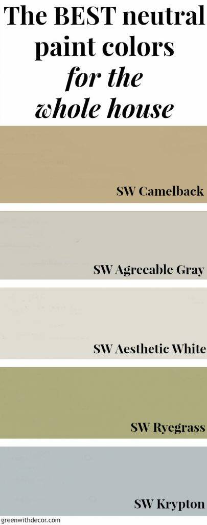
Today I’m sharing my favorite neutral paint colors we use throughout our whole house.
Two of the questions I get asked the most are “What paint color is that?” and “Where’d you get that?” so this post should be helpful if you’re searching for pretty neutral paint colors. (And this page should answer all of the “Where’d you get that” questions.)
I’m walking through my favorite tan, gray, off-white, green and blue paint colors below.
I tend to go with neutral paint colors in the coastal/natural design style and then add color when decorating with artwork, bedspreads, pillows, blankets, etc.
But we usually use color (green or blue) on the bathroom walls. Something about the smaller room size always seems like it could use a bit more color.
When picking paint colors, I think it’s helpful to see paint colors in real rooms. It can be so hard to pick colors based on swatches.
So I’m sharing pictures of the colors in different spaces (in various houses we’ve lived in, hence the multiple kitchens!).
This post contains affiliate links. This means if you click the link and buy something, I may receive a small percentage of sales at no extra cost to you.
The best neutral paint colors for the whole house:
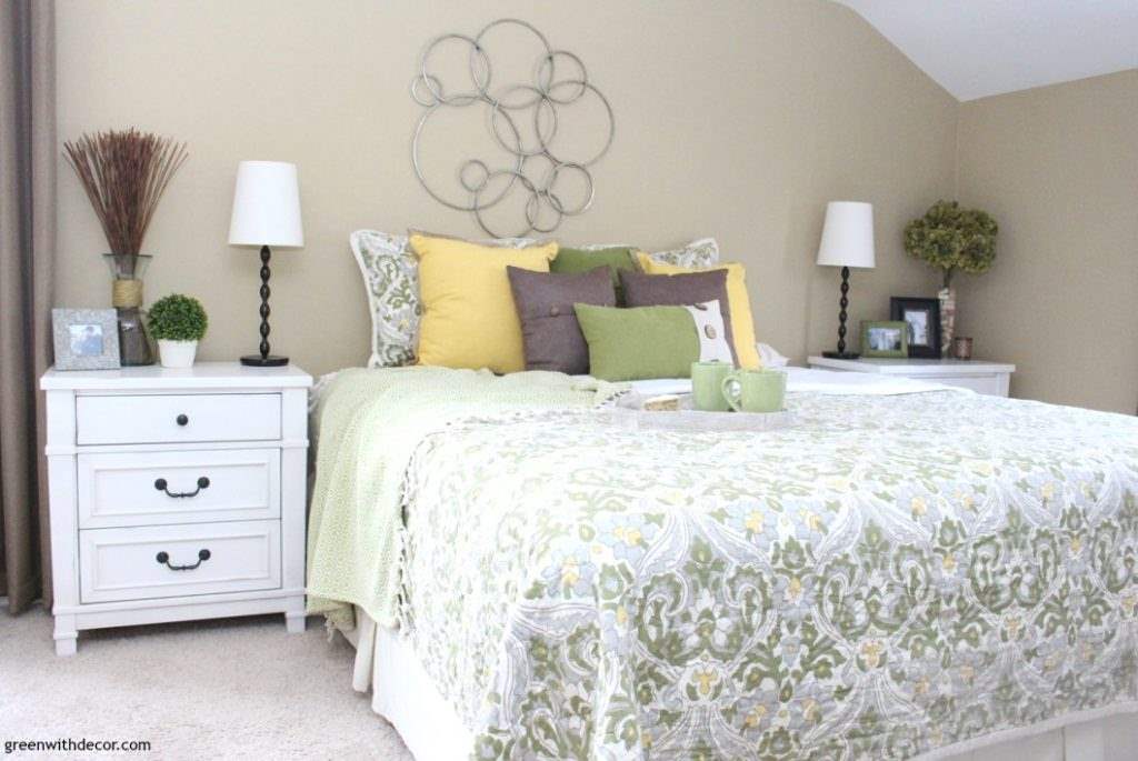
TAN PAINT: Camelback by Sherwin Williams (SW 6122)
This is my faaaavorite tan. It’s a great neutral, and I love the warmth it gives a room. (FYI, I think the paint swatch looks darker than the color dries on the wall.)
We’ve used Camelback in living and family rooms, kitchens and bedrooms.
GET THE LOOK: Lamps | Pillows: Green, Yellow, Brown | Faux boxwood plant | Wall decor
We’ve paired Camelback with accessories in just about every color – green, blue, red, yellow, white, black – and it looks great with them all.
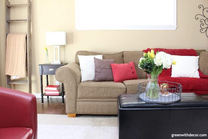
GET THE LOOK: Tan blanket | End table | Silver lamp | Couch | Brown pillow | Red pillow | Rug
And of course, we love it with our white cabinets and counters in our kitchen.

GET THE LOOK: Bronze letter | Metal basket | Window valances | Curtain rods | Green spatula | Cabinet handles
You can see even more pictures of Camelback here.
GRAY PAINT: Agreeable Gray by Sherwin Williams (SW 7029)
If you’re loving gray more than tan, Agreeable Gray is a pretty light gray and a good neutral if you’re debating between shades of tan/beige/gray. It’s light so the gray color isn’t overpowering, I didn’t want anything too dark.
(I think the paint swatch looks darker than the color on the walls with this one, too. Paint samples and looking at real life rooms are such good things!)
I looked at a lot of grays before deciding on Agreeable Gray.
GET THE LOOK: Couch | Artwork: Small boat, Big boat, Beach/pier, Green fishing nets | Pillows: Aqua + white, Navy + white, Brown, Green + white | Blanket
It looks great with white woodwork (and white curtains!).
We’ve used it in the living room, dining room, bedrooms and home office.
GET THE LOOK: White painted chest | Crates(here or here) | Curtains | Rope sphere | White letter | Faux boxwood plant
The debate between tan and gray is a hot one. Trends are a funny thing, because really you should paint your house whatever color you love!
I swore I’d never use gray paint, and then we did. I figured since we had a blank slate the third time around, I wanted to try it.
We like it, but after living with both tan and gray walls, if I had to pick between the two, I’d have to say I’m still more drawn to tan walls.
If you really can’t decide, paint samples on your wall and live with them for a few weeks. See how they look in bright sunlight, on cloudy days, at night, next to different throw pillows and artwork, etc.
You can see even more pictures of Agreeable Gray here.
OFF-WHITE PAINT: Aesthetic White by Sherwin Williams (SW 7035)
This is the perfect off-white, especially if you’re looking to lighten up a kitchen or bathroom with dark cabinets/vanity.
GET THE LOOK: Cabinet handles | Rug | Boxwood plant | Initial tray
I never thought I’d use a white paint color on walls (I love it on trim and doors), but I’m a huge fan of this Aesthetic White.
It does go on pretty gray (and the swatch makes it looks grayer than it is). I was worried I wouldn’t like it when I first started painting, but I love the color when it dries.
I absolutely love it in our back foyer/mudroom.
This picture gives you a good idea of how it looks against pure white trim (and white bench) here. I really love it with the dark wood color of the hooks/crates/message center.
GET THE LOOK: Wood + metal hooks | Brown scarf | Green scarf | Wood message center | Bench | Crates | Rug | Big pillow | Small pillow
You can see more pictures of Aesthetic White here.
GREEN PAINT: Ryegrass by Sherwin Williams (SW 6423)
We’ve used Ryegrass in most of our bathrooms in various houses, and it’s one of my favorites. (I think it’s a big brighter than the swatch.)
It’s just that perfect shade of sage-y green without being too dark, too pastel or too bright. Greens can be hard!
I will say, I really love it paired with white woodwork (like in this bathroom) …
GET THE LOOK: Vanity (handle and knobs) | Light fixture | Mirror | Baskets
… it looks a bit darker when paired with brown (like with the vanity in this bathroom).
GET THE LOOK: White hooks | Mirror | Silver towel ring | Hand towel | Soap dispenser | White rug
We have Ryegrass in our home office, too:
GET THE LOOK: Curtains | Curtain rod | Blanket | Chaise | Lamp shade | Desk | Desk chair
You can see more pictures of Ryegrass here.
BLUE PAINT: Krypton by Sherwin Williams (SW 6427)
I spent a looooot of time looking at blues, there are just so many.
I love Krypton. It’s the perfect coastal/nautical blue.
If anything, it leans a little gray. I didn’t want something too baby blue or bright. (This is probably the closest color to its paint swatch in this whole post!)
It looks great with white and wood trim (or both like in this bathroom).
GET THE LOOK: Soap dispenser | Wooden spool towel rack | Towel
You can see even more pictures of Krypton here.
If you want more paint color inspiration (and tips on painting a room faster), check out these posts:
- Beautiful blue paint colors to get a coastal look
- Pretty green paint colors for every room in the house
- How to paint a room in less time
What are your favorite neutral paint colors? I’d love to hear!
Remember to bookmark or pin this post if you want to save it for later!
Want to read more posts like this?
Follow along: Get my emails | Facebook | Pinterest | Twitter | Instagram
Sho says
I have strong pecan colored kitchen cabinets. Light oak chairs, table, and a taupe green couch.
Obviously the beige/tan family goes well with it, but I have that and am looking for change.
Was loving the ryegrass green for the kitchen, and was thinking agreeable grey for the room that flows into it… Does that go at all? Or just an accent kitchen wall ryegrass, and the rest agreeable grey?
GreenWithDecor says
Ryegrass and Agreeable Gray go great together! We have them in rooms next to each other, and they look great! Happy painting!
Heidi says
I stumbled on this and it’s PERFECT and I want to thank you!! Your comments seem like my own, and I am drawn to your style. Simple and practical. We are building a home this summer in a wooded area in Texas. I want a palette that is close to nature and love this. I feel like I nailed it. All I find out there is grey! Thank you so much for posting this.
GreenWithDecor says
So glad you found me, Heidi!! Good luck building your home – how exciting!
Sharon Winn says
What is your favorite white for cabinets and what finish, going to paint my bathroom cabinets
GreenWithDecor says
Sorry, I don’t have a good answer for you on this! We bought our white cabinets during our renovation so we didn’t paint them. My parents painted their cabinets – they used Dover White by Sherwin Williams (Eggshell finish) – and they have held up well. It’s a little more off-white than our white kitchen cabinets are though.
Julie says
Hi, does Aesthetic White ever look pinkish to you?
GreenWithDecor says
Hi Julie! I’ve never noticed any pinkish hues in Aesthetic White.